
Alison
Cosmetics
This project centered on creating a unique and adaptable logo to enhance Alison Cosmetics' brand identity, reinforcing their ambition to become a trusted name in the beauty industry and capturing their aim of standing out in the luxury skincare space.
From my research into the beauty industry, it’s clear that wordmark or logotype logos dominate the space. This trend aligns with how consumers tend to associate brand names directly with product efficacy, favoring logos that reinforce brand recognition through simple, bold typography.

Because the brand exclusively uses vegan-friendly ingredients in its skincare products, it was essential to reflect this commitment in the logo design. Given their need for a compact logo format for packaging, I opted to create both a wordmark and an emblem, offering versatile options to represent the brand across various applications.
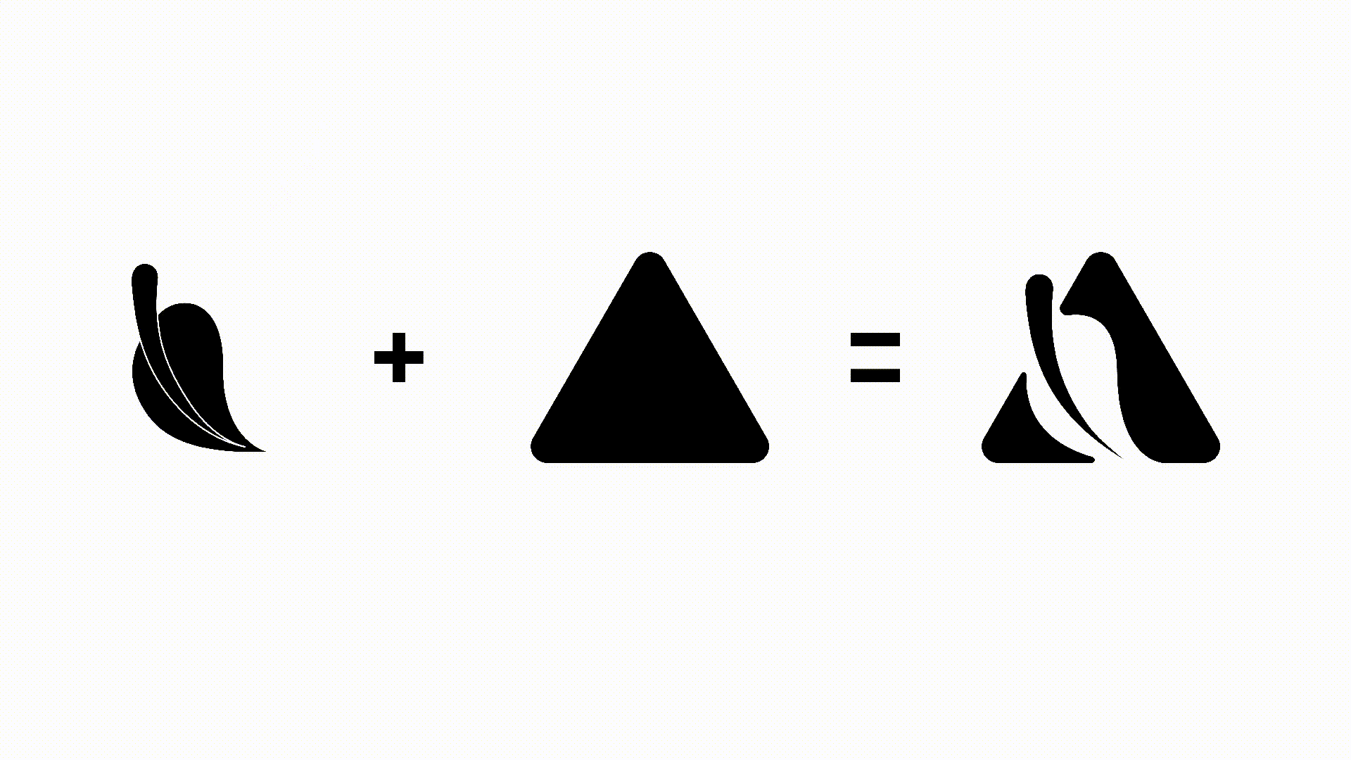
I incorporated a vegan motif into the emblem to communicate the brand’s ethos instantly. It was also essential that the design fit neatly within a square or circular format, enabling use in more intricate branding applications like packaging stickers or product tags. To ensure clarity and visual impact, I aimed for a bold logo that would remain visually striking across various brand elements.


Initially, I considered using more commonly seen fonts to create a neutral branding look, but I felt that approach was overused. Instead, I chose typefaces that better align with the brand’s target audience, adding a fresh, tailored feel.
I find the Quiche typeface strikes a perfect balance between elegance and professionalism, similar to the refined branding often seen in high-end brands.

To elaborate on what I wanted to express in terms of the typeface used, I gave them a mockup of how all of these design aspects so far link together when it comes to the marketing side of the brand as shown in the billboard mockups below.
They provided a color palette to be used across all branding tasks, including the physical products. To enhance the impact of the main color, I recommended pairing it with a complementary tone. This contrast helps the products stand out in any marketing media, highlighting the brand’s visual identity.


Here are some more mockups that I made for the brand showcasing how they can use the logos further when it comes to any future product and packaging design.


Being one of my first branding projects, this was a challenging yet rewarding experience, especially since the beauty industry was unfamiliar territory. Exploring diverse approaches for the logo and its supporting marketing media allowed me to deepen my design skills and broaden my perspective. Overall, it was a valuable growth experience.