Sushi Zen
SushiZen is a well known sushi restaurant that was in dire need of a rebranding to channel their use of traditional cooking practices through their brand and branding visuals. They have tasked me to create a logo for them and any rebranding needed to showcase their passion for authentic food to their customers and their critics.
As usual, I started drafting some designs to show what directions I think the restaurant should go for, ranging from symmetrical and symbolic ones to represent their authenticity.
Whilst making the draft designs, I wanted to incorporate a sense of calmness to the logo as the restaurant name implies — things such as kanji characters, brush strokes, handmade, meditation, etc. When utilised during the draft session, I feel like these aspects might point me in the right direction when it comes to Japanese authenticity.
I started exploring the idea of incorporating a lotus flower into the design. Known as a symbol of peace and tranquility, the lotus perfectly aligned with the restaurant's ethos. Its striking imagery provided a strong foundation for creating the restaurant’s iconography, allowing me to build a visual identity that felt both meaningful and captivating.


As you've already seen on the first logo drafts, using the lotus as the main imagery for the restaurant gave me ideas for these following drafts...

Since I usually take my time when designing the first initial drafts of a logo design, I will already have a few favorites to pick from when it comes to moving the project forward so naturally I already had my eyes set on a design that I liked that embodied the feel that I was going for.
However, I feel like it's still missing something, so I decided to develop the design further. To do that, I wanted to create something akin to Japanese signage complete with handwritten Kanji together with the emblem I created prior.


Looking at these images as inspiration, I was able to create calligraphy that embodies the "hand-drawn" feel to create that aspect of authenticity to the restaurant.

Out of curiosity, I made another iteration of this logo as I think that the design is malleable enough to be used in different ways for marketing.


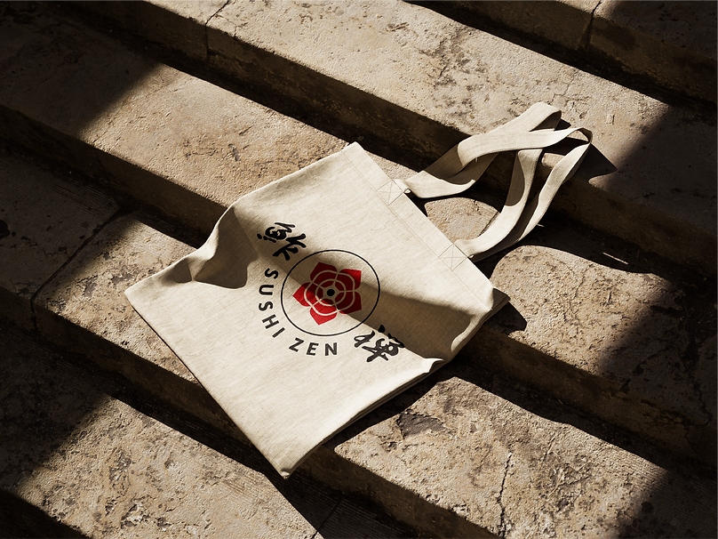
With the client's approval of all the designs for the logo iterations, I then made some mockups for how these logos will be used with their branding.


The Japanese minimal, hand-drawn style always appealed to me growing up so doing this project was a pretty great experience as I was able to draw on Japanese iconography which has inspired me for a long time. The challenge within this project was to make the restaurant not look like a cheap knock-off of what Japanese restaurants look like normally so I had to make sure I don't overdesign certain things but still try to retain that "authentic" look that I was going for.