
ZeldaGuide
Every project is a journey, and working with ZeldaGuide offered an immersive creative exploration, balancing the brand's personality with industry expectations. As a niche publisher of videos, articles, and community events surrounding the Legend of Zelda games, ZeldaGuide sought to establish consistent branding—an ongoing challenge over recent years.
The primary task was to design a logo that embodied the brand's identity. Given the focus on Zelda content, the logo needed to subtly honor the games while steering clear of potential copyright issues with Nintendo, the franchise’s parent company.
With The Legend of Zelda series being an icon in the gaming industry and known for its distinctive visual style, it can be easy to copy certain assets of the games into my designs thus it was essential to ensure the logo remained original and legally sound.

My main idea was to use wordplay on the company name by emphasizing 'Guide' in ZeldaGuide, underscoring the brand's mission to provide direction for fans. I incorporated iconic imagery, like the sword and wing motifs from the game series, to evoke a sense of nostalgia and connection for long-time fans so its relatable.
These elements were carefully chosen not only to pay subtle homage to the Zelda universe but to also create a visual bridge between the company’s mission and the emotional resonance of the game series.By weaving in these familiar symbols, the logo becomes more than just an identifier—it becomes a symbol of community and shared passion that ZeldaGuide aims to foster among its audience.

I then redesigned the draft logo after picking the design aspects I wanted to keep from the selection.

Which I then expanded on by adding more design cues from the games to make it more nostalgic.

I experimented with silhouettes to explore additional design cues I could incorporate from previous concepts. After some deliberation and feedback highlighting that the initial design felt too simplified, I decided to refine these elements into a mock logo with added detail. This approach allowed me to maintain the fantasy aspect of the designs while enhancing visual depth and intricacy.


I then refined it further into a balanced logo, adjusting the proportions which were initially a bit uneven.

With the clients happy with how the logo turned out, I finalised the logo in Illustrator so we can move forward on to changing the branding of the company with the new logo created.

Before moving on to mockups and marketing materials, I needed to complete the logo by designing a logomark to accompany the emblem I created. The goal was to keep it modern while subtly referencing the franchise to connect with the target audience. By this stage, I had a clear design concept, but choosing the right typeface was crucial—it needed to complement the logo seamlessly for a cohesive brand identity.

Above are the picks that I thought would suit the designs that I have made so far. I made sure that the typefaces selected had something to do with either the theme of the game, relate to anything within the games or evoke enough nostalgia when used with some typefaces a little more exagerated than others. This would be vital to the project as this could set the overall feel of how the company is recieved by the public. In the end I ended up using "Radar Fina" as the baseline logotype design which I then modified to fit the design aim that I was after.

These are the typefaces I felt would best suit the designs I’ve developed so far. I made sure each choice aligned with the game’s theme, evoked elements from within the game itself or brought a sense of nostalgia—some fonts being more exaggerated than others. This step was crucial, as the selected typeface would shape the brand’s overall impression on its audience. Ultimately, I chose Radar Fina as the base for the logotype, which I customized to achieve the precise design style I envisioned. Coupled with the game title logomark composition, it gives a more modern take to a beloved franchise without completely changing how people see the brand in relation to the series.
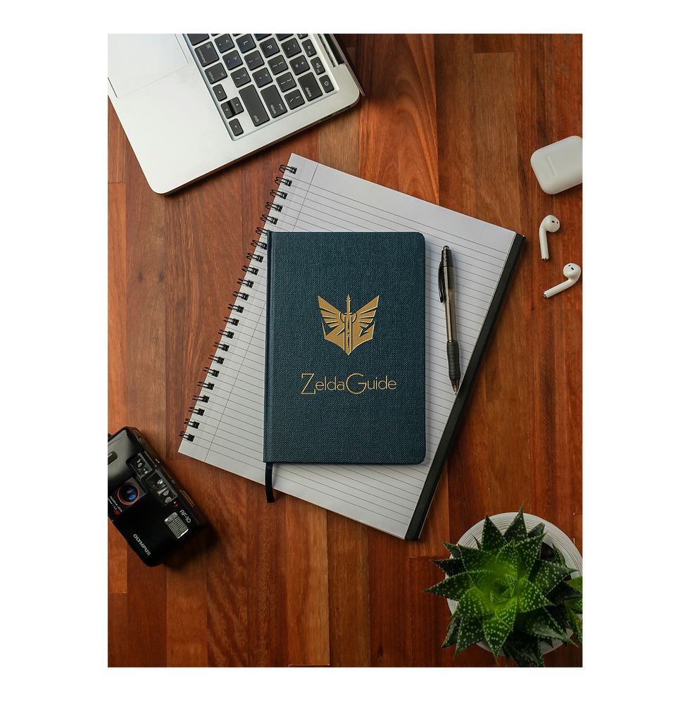
I then put the two logo assets together which gave me this overall logo design....

With the logo design completed to the client’s satisfaction, I received the green light to proceed with branding and marketing concepts.
My approach was to provide the client with ideas for merchandise that could resonate within their gaming community—items their audience could use both while gaming and in daily life. Specifically, they requested a t-shirt design, as they’re eager to launch a t-shirt shop on their website. I kept the design straightforward and impactful to align with this vision.


I then followed this up with more mockup designs of what they might be able to sell to their fanbase.


As someone unfamiliar with the Zelda series, this project was both challenging and enlightening. Research became essential—not just to understand the brand but to capture the spirit of its community through design. This project highlighted how in-depth research can streamline the design process and ensure that each element resonates with the audience. It also reinforced that understanding a client’s world is key to creating authentic and effective branding.